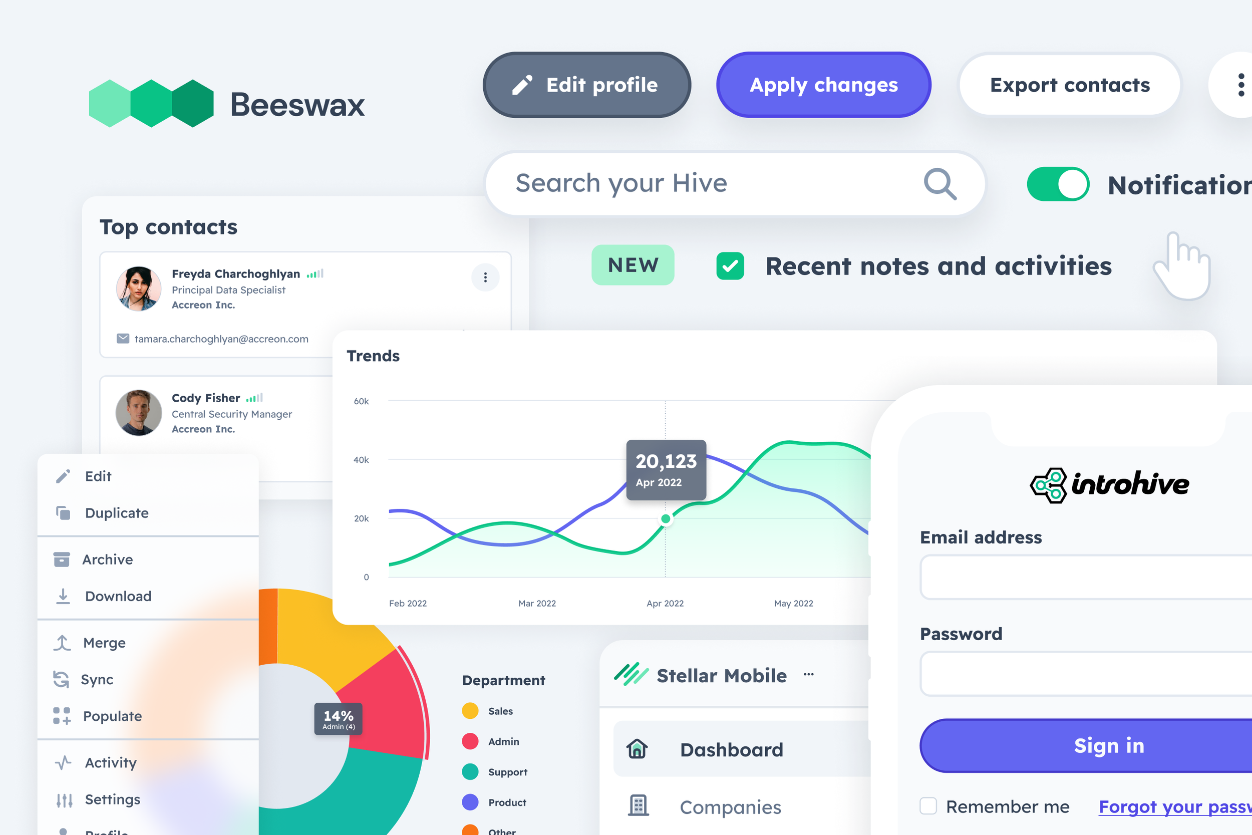
Modernizing a legacy product suite
Newer products being built in today’s world of design systems and new tech have an advantage when it comes to designing and building consistently at scale.
However, there are many software companies that began with a full-stack engineer that pulled experiences together with maybe the help of a designer. Every designer or engineer that touched the product over the years as funding came in, put their own spin on it, and eventually, you have a disconnected product suite that has a fragmented visual and functional experience.
Over the last eight years, I have spearheaded and managed three design system initiatives at Cvent, FieldEffect, and Introhive. Each had its own unique cross-functional challenges that had to be navigated.

Phase 1 - Look-alike at scale
The scope of the look-alike phase did not change function or layout, it was simply a coat of paint. This helped us get customers comfortable to change while not rolling out massive wide sweeping changes but still moving towards our larger goal of a scalable and cohesive design.
The first part of this phase was a three month project that allowed us to build a new visual design language that acted as the foundation to build product comps. At the end of exploration and validation internally, we landed on five design tiles, eventually narrowed to one (samples below)
Design Tile Comps
Once we landed on the visual direction, the second step was visually updating each product using the new foundational design direction created. Given this exercise was to keep scope tight, visually align our products and get our users ready to see more sweeping changes in the future, we had to apply the visual direction carefully and thoughtfully. We spent four quarters surgically updating legacy products visually and modifying the underlying code to set us up for future design system updates.
Before and after screens
How we modernized Introhive and built Beeswax, Intohive’s design system, at the same time.
At Introhive, there was a significant gap in product experiences. Every product looked, felt, and functioned differently. Our users had not seen a major visual update in years. We needed to start scaling our products and we needed tools for efficiency. These tools needed to accommodate the current legacy tech AND scale to meet the standards of today’s newer technology.
I lead the efforts with a small team of one designer and one front-end architect.
What was unique about standing up this design system is that our users had been coddled by our sales and CSM team for years. So much so that even the slightest of changes made without written communication months in advance would set them into a fury. We had to be thoughtful and well-planned in the way we launched a design system. To build a tool for scale that aided our designers, engineers AND served our resistant-to-change users. We took a phased approach to build comfort.
Phase 2 - Connected Ecosystem
To continue the momentum after visually refreshing our products in phase one, we began introducing platform navigation that started connecting our products together. This was a key move to make while building the design system in the background as it allowed us to implement a pivitol pattern for scale in the ever-growing design system library.
Phase 3 - Function alike at scale (planned for 2023 and beyond)
This phase is running parallel to the other phases but doesn’t have a completion date until late 2023. In this phase, we will officially launch the design system, begin pulling componentry from a centralized repository and launch our official document library.
At this stage of the program, we will be able to build any new products 100% driven by the design system. Until then, teams will only have visual guides to direct them with any design system implementation.
